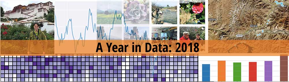
What can one learn from a year in data? What lessons and observations can be drawn from tracking a life?
Before jumping into the analysis, here are three “teaser” data visualizations and questions that data helped me notice and answer from the last year:

The majority of my manually logged time went to personal projects in 2018, which is great. I still maintained decent client, freelance income, but my focus remains on own stuff and businesses. . If these are your goals, this is where your time should go. But happened in June and August? Both months saw a decent time log drop. Both months had me speaking and attending more conferences as well as more travel, including a week long trip with friends to Tibet and aroudn Sichuan. My sleep tells another story though too

I slept on average 7.23 hr per night in 2018, but what happened starting in mid-June? Why did my sleep average drop? World Cup! Like many I stayed up later and drank a bit beer more as I enjoyed an epic month of football action. Ironically other areas also dropped too. I wrote less and had less workouts. See below for the specific charts.

I had a relatively consistent year of running in 2018, until the last quarter of the year? What happened? Suddenly my run training load dipped signficantly. This was due to a series of minor to a bit more major injuries, and I couldn’t train. What was the cause? Below I examine a series of other tracked data points and currently my working hypothesis is one contributing factor was a decrease in both mobility/stretching and strength training.
These are three data visualizations I created using simple but regular self-tracking and data collection data visualization using QS Ledger. If you are interested in creating similar charts or becoming more data-driven in the year ahead, signup for my newsletter to receive early access to my course, Google Data Studio for Quantified Self and the Data-Driven Life in early 2019.
Now on with the show!
My Data-Driven Annual Review
Annual reviews are a staple of goal-directed people, and it’s something I like to do myself. But in view of my central thesis that data can be used to improve human lives, I like to go a bit beyond just nostagic reflection or hopeful and strategic aspiration. I like to fuel my year in review with data.
Let me tease out my core belief briefl here, We have now enough cheap technology, sensors, small computers (i.e. phones and wearables) and cloud storage to enable both tracking a lot of areas and storing a huge amount of data on a life. This activity is often grouped under monikers like quantified self, self-tracking, personal infomatics, or the data-driven life.
Basically, it’s people collecting data on a life and trying to use it. Quite simply, I can and should use data and self-tracking so our lives can be better understood and improved. This is data-driven personal development 101.
So, it’s with those goals and hopes in mind, I’m happy to share the latest edition of my year in data!
This year’s report includes a look at how I wrote, my computer usage time and project time, my trends in tasks completed, books and articles read, my fitness efforts, and a bit of my photos taken on my phone. For health, I place an emphasis on running but also have some general health and wellness data on sleep and HRV too. Obviously there is a ton of data one might use to slice and dice and tell your year in review story. I choose these since they matter to me and are relatively accessilble to anyone to track.
One bonus this year is that, unlike last year’s year in data, I’m also open sourcing and sharing all of the code I used to create these graphics. So for anyone with a few technical skills and some time, you too can build your own data-driven year in review. Morever with a few tweaks you can change the look and feel or make additional observations and analysis too. You can find the code at QS Ledger, and I’ve shared a few of the specifics on how to do this at the end of the post.
Hopefully by the end of the next year, I’ll have a web or mobile app to make it even easier for anyone to do and even create a full-on book about your year… using data.
Let’s take a look at the story of my year in data!
(NOTE: While outside of the scope here, I have also done some work on a deeper statistical analysis and machine learning approach to using this data. For now I’ll have to leave that topic for a future write-up. )
The Backstory: A Year of Going From Tracking to Engaging with Data…
(NOTE: This section goes a bit deep into the details, so feel free to skip below to get directly into the analysis and data viz!)
First things first, it’s probably worth telling you a bit about what I track and why I track all of this stuff.
One of my core belief is that data and tracking can help us better understand our selves and empower self-improvement. I don’t just track because I find it an amusing hobby. I track my life in order to better understand myself and, in turn, make improvements and personal optimizations. Tracking started as a somewhat skeptical questioning of where my time was going and expanded into other areas to understand how activities in a life affect one another.
What did I track in 2018? I didn’t make too many explicit tracking changes in 2018, compared to what I tracked in 2017, besides changing how I track habits (I now use Habitica) and how I measure my device screentime (I use Apple’s Screentime). That said, I do track my fair share of things and will continue to do so.
If you are looking for ideas on things you might track, check out my post: What should you be tracking in 2019? where I go into a two-step process of what to track and how to enage with your data towards your goals.
Unlike 2017, my main focus in 2018 was not on the how-to of tracking but on data engagement. My objective was to make data useful and meaningful. I stopped using Tableau, which was the primary data tool I used for my analysis and charts in my 2017 Year in Data blog post. Tableau is quite expensive and being a drag and drop tool means that it’s not as easy to reproduce data visualization like you do in code. It also means it’s not extensible to creating a future web tool or shareable scripts.
With this year focused on data science with Python, I have transitioned to using Pandas and Matplotlib to do most of my data analysis work, including this year’s data review. It’s not pixel perfect yet, but I’m quite content with the results. On the day-to-day and week-to-week, I use a combination of IFTTT, Google Sheets and Google Data Studio to power my personal data dashboards.
Practically-speaking, this change to Python Data Visualization translated into spending a good amount of my time on learning Python and writing code for data collection, data visualization and even some machine learning. this was my first time using Python in many years, and I’m really happy with the language and tools available. I shared my learnings and process across several speeches at PyCons around the region. You can find the latest version at: How to Become a Data-Driven You: From Data Collection and Data Processing to Data Analysis and Data Visualization to Machine Learning and Deep Learning with Python.
Additionally, the underlying code has all been open sourced and is available on Github at QS Ledger. In fact, nearly everything in this post can be reproduced using your own data and that code. The only real work I did, besides the data analysis in code, was assembling the charts into a single image and adding a few styles with Photoshop.
To recap, in 2018, I tracked my steps, HR and sleep on the Apple Watch, runs with Strava, strength workouts with Fitbod app, photos taken with PhotoStats.io, books read with Goodreads, articles read with Pocket/Instapaper, tasks with Todoist, Heart Rate Variablity with HRV4Training, Podcast listening with PodcastTracker.com, project time with Toggl, and Computer Time with RescueTime. These are all the areas in which I have longitudinal data across the entire year.
Additionally, I have some periodic check-in data for blood pressure and weight, and I did a few other short tracking experiments, including glucose monitoring and a rather amusing poop tracking experiment.
Spanning health, productivity, creativity, time and a few other areas, these charts are my attempt to tell a data story. 2018 was a year where I went beyond self-tracking and data accumulation and I started to become more conscious about using and engaging with my data towards an end in mind, namely building a world where data can improve lives. Now my goal is to help people learn about possiblities of using tracking data to reach their goals and bring more accessiblity to personal data analysis too.
So inspired by all the data I collected, analyzed, visualized and built on, here is my year in data!
My Year Overview in Google Data Studio:
Before jumping into my specific data visualizations, let’s quickly look at my last weekly review of 2018. Here is what my productivity dashboard looks like:

Here are my health and fitness stats:

I’m happy to say I closed out 2018 with some good exercise and a bit of a break. Globally, you can see some of the trends in sleep and exercise. My sleep had some big dips in weekly 27 to 29. What happened there? My running peaked early in 2018, but I didn’t quite manage to keep that trend in the second half. I see similar trends in mobility and strength training. My productive time saw generally positive trends but with some interesting dips during the year.
These personal data dashboards and reports were created using a combination of Google Forms, Google Sheets and Google Data Studio. You can signup for my newsletter to get first access to my course Google Data Studio for Quantified Self and the Data-Driven Life in early 2019.
Let’s look at breakdown of this tracking data below.
A Year in Time: My Year in Computer Usage and Logged Project Time with Toggl
I’ve been tracking both my computer time and my manually logged project time for a number of year. This presents an interesting opportunityt to explore various changes in where my time goes in a year.
Overall, here is what my last year looked like:

Some Time Usage Takeaways:
- More Deep Work in 2018: I’m a big fan of Cal Newport book and argument in favor of “Deep Work.” Basically he argues that in a distracted world, those who can focus and work on cognitive difficult tasks will be productive, creative and produce higher quality work. This is how I approach and structure my day. I spend mornings and afternoons on important, challenging tasks. Then I take a break in afternoon for exercise, dinner and a walk. In the evenings I work on less challenging tasks and administrative work. Practically speaking this translated into a few days where I went really deep and spent upwards of 10+ hours working. I find that combined with a few more days of true breaks, this deep approach works for me.
- 21 day off the computer in 2018: I spent 344 days on my computer, which was down from previous years where I spent 362 (2017), 362 (2016), and 364 (2015). Basically, I took a few periods to get completely off of the computer. It was somewhat hard initially, but after a day or two, it was liberating to not open my computer and instead create, think, write and read in a different way. I like this idea of a digital break, and I will try to do it again in 2019.
- More Time on Software Development and Coding Studies: According to actual program usage in RescueTime, I spent almost 300 more on software development (2018: 563.7 hrs vs. 2017: 268.5 hrs). According to my project logs, I hit my goal of over 312 hours on coding studies for the year too. While I’ve been a developer for years, this was the first year in awhile where I very consciously wanted to learn a new program language (Python) and get more involved with engineering. Additionally, this showed up in a few side projects or startup-lite efforts, including my apps PhotoStats.io and BioMarkerTracker as well as PodcastTracker.com. The big thing remains QS Ledger (more on this at the end).
- Less Email: One of my goals for 2018 was even less email. In 2017, I was on email over 149.8 hrs and scarily in 2015 I was spending 405.1 hrs a year on email alone. But in 2018, email wasn’t even in the top 7. As I like to say, no one ever gets an award for fastest email response time. But they do get it for getting important, valuable work done and done well. Interestingly, I also spent less time on organizational work, like project, task and goal goal planning in 2018 compared to 2017. This likely means I know what I should do and don’t waste it on “productivity porn” as much.
- More Writing, Striving to go Pro: I’ve finally embraced writing as more than a personal passion, and I am striving to go pro now. My data reveals what means in terms of time spent on writing. According to purely my app usage logs from RescueTime, I spent 429.8 hrs on Writing apps in 2018, which comparatively is an increase from 379.3 hrs in 2017 and 298.9 hrs in 2016. According to my actively logged project time as “writing” I spent 370 hour on writing in 2018 compared to 227h in 2017. While I didn’t publish as many blogs, I am writing a book and creating an online course, both of which are highly tied into my writing skills.
My Biggest General Takeaway about My Time: I spent 25% of my total time on my computer and a bit under that amount than on project time. This ratio of project time vs. computer time remains a clear measurement of my productive efforts. 25% of a day, week or year on the computer seems like a good number, and I don’t really think I can make greater efforts in 2019. I can get more effective and balanced in some ways. For example, I’d like to be a bit more consistent around client work such that I have less clusting and more regular output. Moreover, I deserve to get paid so I need to think and drive my efforts to renumeration in the year to come. Basically I’ve created a series of side project over the last 2 years, so I plan to true targetting campaigns and efforts to generate revenue. Globally though, if I follow my general time management and time allotment to similar effect in the year to come big things will eventually happen. Push that boulder!
A Year of Fitness and Running
I ran two marathons and two half marathons in 2018 and did my fair share of fun runs and training along the way too. I’m a fan of running and find having this kind of regular exercise has had very positive impact on my creativity and life satisifation. I’m still trying to get more consistent in my strength training and mobility/stretching. Here is what my year in fitness looked like:

One of the most startling realizations from looking at this data and comparing it with 2017 was the sharp decrease in mobility training time. I did not do anywhere near as much post-workout recovery (roughly 40% decrease in mobility time from 2017 to 2018). This has lead me to wonder if this lack of stretching and recovery was a factor in why I had more injuries and poorer performance in 2018.
For now, I’m going to assume it was and will aim to increase my mobility work towards 2017’s levels. I hope this alleviates my aches and pains and provides a stronger foundation for running well in the year ahead. I should be able to tease out an effect in the coming months.
My strength training dipped in the second half of the year. I want to get a bit stronger and more muscular in the year ahead so strength training will be key pursuit and hopefully I can tease out more of my progress (or lack of) from data too. Consistency is king.
Tasks Completed: My Year in Tasks and Projects with Todoist
I remain a huge fan of Todoist. Todoist is an excellent task manager in the spirit of GTD and provide great data accessiblity which makes it one of the best task trackers too.
Once I again I checked off a lot of tasks in 2018. I didn’t note it in this data analysis, but I’ve started to focus more on higher priority tasks over just checking off a bunch of medium importance stuff. Overall, a very consistent output in 2018 as we can see in the data:

While the main heat map shows a year of fairly consistent task completion, the bottom half of this visualization allows me to notice patterns and certain periods of increased activity on certain projects.
For example, for productivity tasks, we see a consistent pale purpose across nearly nearly every Sunday of the year. This is when I check off a tasks or two doing my weekly review and set my goals. Similarly my coding studies is often scheduled and completed on Saturdays, and the heatmap reveals this trend as well with some noteable density in more tasks going on then. It would be interesting to find a way to visuzlize project tasks in better way so we see them in differ day of week quadrants.
In contrast, I see several projects with periodic clustering. This is true for Data-Driven You (an online course and book project), Language Learning while I attempted to learn some Thai in April, and a scattering of Travel tasks leading up and during certain trips.
Overall, I’m happy with the tasks I’m getting done and will continue to push myself towards my goals. In the future, I hope to be able to better connect my tasks with my goals, which I’m attempting to track as well now in a consistent manner.
A Year in Writing
2018 was a year I really embraced writing as a professional pursuit. I published 26 blog posts, prepared dozen or so lesson articles for a course I’m creating, and I have a work-in-progress manuscript. Writing is a habit for me, and I still do a lot of writing as a form of learning and research, but it is slowly coming together towards actual publishable manuscripts.
My writing behavior deserves better data analysis, but for now, here are a collection of data visualizations based on WordCounter, a Mac tool I use to count how many words I type each hour in a selected set of writing apps:


A few obvious takeaways on my writings:
- A Mid-Morning Writer: I consistently write in the mornings, both as a productivity habit and for my work. My peak writing time is from 10am to noon. I should aim at continuing to aggressively protect this block of time for writing in the future. It’s obviously working for me.
- A Changing Writer’s Toolkit: For my writer’s toolkit, I’ve been a long-time Evernote user, but I recently switched to writing and note-taking in plaintext markdown files. Since migrating off of Evernote, I’m committed to this new approach. This change to plaintext files also comes with a new ability to track my writings. I can follow the the evolution of my ideas, studies and writings too. I plan to share a write up and code on this soon. This should provide some interesting tracking data in the coming months.
- Monthly Variations: I had a consistent writing habit and output until summer when things started to dip. Activity increased again from Sept until the end of the year. I’m not sure it’s bad to see these kinds of variations. Deep work can be flexible according to the project. Breaks are necessary as well. It’s good to see general consistency, but I’m a fan of going deep and hard during certain times and towards deadlines and then taking a full break.
- Where’s the publications data analysis? I definitely need to do a data analysis of my actual manuscripts. I can start with a simple automation script to extract word counts and date of publication from all of my past writings. This is also on my list to work on.
A Year in Sleep and Health
Since I getting healthier, losing weight and become more physically active, I’ve discovered a lot about myself and being human. While I could have placed this at the beginning, I placed this visualization at the end since it offers an interesting way to view the other aspects of the year in relation to these trends.
Let’s look at the data:

Here are some quick observations:
- 2018 was a healthy year: I averaged about 7.23 hours of sleep a night, I had less sick days (2 in 2018 vs 5 in 2017), my VO2Max, which is a measure of your a maximum-oxygen-processing capacity, is quite healthy, and my Heart Rate Variablity (HRV) was relatively stable.
- Why did my sleep decrease from June to July?: World Cup! You hear about the world cup having a productivity effect across the world. I definitely saw my own impact from staying up late, drinking beer and watching a lot of football. The kickoff also overlapped with a big speaking engagement and preparations then too.
- Trending (Slightly) Negative: Several of my health metrics are trending slightly negatively, including HRV, VO2 Max and some of my sleep. I also drank more regularly in 2018. My own memory is a terrible indicator if I felt better or worse in 2018 compared to 2017. I had a good year, but I have some data I can look at to tease out my subjective feelings. For now, these core indicators do call out for some efforts to stablize a downward trend. I did have some running injuries and a degree of personal stress at certain periods. Some possible options would be better sleep patterns (rather than just more sleep), intentional relaxation and maybe meditation.
My Biggest General Takeaway about My Health: I didn’t have time for a true statistical data analysis just yet, but these health visualizations do hint at some degree of connections and correlations between a slightly negative trend in my health and the effects in various areas of my life see in the other charts. For example, one might ask: did my dip in sleep and increase in drinking affect my fitness performance, creativity, and learning? Did doing less stretching and mobility impact other areas? How did getting up at a certain time affect a day or the day after? These are all questions I hope to explore in the future, both for myself and others.
For now my main actionable item is structure more time for sleep and stretching add some meditation too. Basically, don’t just plan for the projects and goals but include relaxation items too.
In turn, I am overdue for some some blood biomarker testing to see if there are some nutritional or other imbalances I can work on. I have an open source database on the most common and useful blood biomarkers, if you would like more info or know what tests to get.
A Year in Reading

For full details and infographic on what I read and when as well as my personal favorite books and articles, see: 2018: Year in Reading.
A Year in Photos
The photos we take can also tell a story about our lives. This is the motivation behind why I built PhotoStats.io, a mobile app for Apple and Android that lets you locally count and parse out your photo-taking life. Along with helping you track your photo history and tag the images, the app provides some simple charts and graphs. The AI-powered auto-tagging feature can also help you classify and understand what’s in your photos.
So, what did my year in photos look like?

My photo data reveals a few interesting things. It shows that I take most photos on the weekend. I take a lot of photos of animals (dogs and cats) as well as plenty of nature photos too. The map I created using the PhotoStats.io export and MapBox map designer tool shows a clear view of where I went this past year, including trips to Laos, a Sichuan road trip and marathon in Xichang, conference in Malaysia, and a trek around Tibet. I can also see my main hubs last year in Singapore, Bangkok and Qingchengshan, near Chengdu.
Like a lot of people, 2018 saw me stepping away from most social media. Facebook and Instagram has too much “performance” art and life, rather than authentic living, and it can turn into both a negative for me in terms of time and enjoyment of the life shining brightly in front of me. That said, I did end up sharing about 35 photos on Instagram in 2018, mostly early in the year and when I had some Europe friends visiting.
Overall, I find photo data remains a very interesting way to understand a life, and I plan to continue maintaining and adding features to PhotoStats.io app. If you are interested, you can checkout the app at www.photostats.io. Assuming you have most of your photos from recent months, it should do a good job giving you some general trends.
Conclusions: The Big Numbers
Here are my “big” numbers from 2018:
- 3,878,369 steps taken and logged.
- 26 blog posts published on www.markwk.com.
- 1559.72km kilometers (969.16 miles) run
- 2 completed 42.2 km marathons
- 2 completed 21.6 half marathons
- 2,991 photos taken, tracked via PhotoStats.io.
- 35 photos posted in social media via my Instagram (a lot less than 2017!)
- 94 days (of time) on computer according to RescueTime
- 84 days (of time) on projects according to manual time tracking
- 2212 completed tasks in Todoist across more than a dozen projects.
- 18,657 book pages read accross 60 books, according to GoodReads
- 1785 articles reading via Pocket and Instapaper
- 132 hours of TV and 82 hours of Movies watched (and logged) according to Trakt.tv.
- 16,855 songs listened to and “scrobbled” in 2018 using Last.fm. My top genres were Synthwave, Electronic and Synthpop. My top track was Cold summer by Le Matos. And my favorite artist was Le Cassette.
Conclusions: Parting Thoughts
Ok. That’s a lot of data and data visualization for a single year. Overall, 2018 was another good year for me. I stayed healthy and worked on things that mattered to me. I made some financial progress and worked on my big vision goal, namely creating a world where data can help improve and augment our lives.
Obviously, this kind of year may not be always the case, and a future year might see much worse trends in my life and in my data. I might get sick, injured or depressed. Life happens. I remain committed to trying to tell my tale each year in data, an authentic and personal one, whether that life is a good one or not.
Going forward I hope to make this kind of tracking and data analysis more and more accessible and understandable to everyone. I’m current creating a course on an online course on Google Data Studio for Quantified Self (planning to release in early 2018) and a longer course on How to Track a Life. I’m also making solid progress on QS Ledger, the main code that powered all of the reports this year.
If you are excited about the possibilities of using data for empowering our world and our lives, join my newsletter or hit me up with a comment, email or social share. The more people bugging me and joining me will definitely push me to do more work in these areas in the year ahead!
I hope you enjoyed this post and found it interesting and inspiring.
Best of luck and happy tracking in the year ahead!
BONUS: Build Your Own Year in Data or Data-Driven Year-in-Review with QS Ledger
All of the data visualizations for my year in review in data were created using QS Ledger, a python data science project focused on data collection and data visualization of your personal tracking data. They were then assembled using Photoshop.
The one exception were the maps. Those were created using MapBox Map Designer and an export of the underlying data into a CSV with the Longitude and Latitude. It’s a pretty simple process using MapBox’s online dataset and mapping tools.
In this section, I want to briefly go through how you can create your year in data using QS Ledger.
PS - If you are interested in the backstory and data science involved in QS Ledger and using Python for Self-Tracking, check out my detailed slides at How to Become a Data-Driven You: From Data Collection and Data Processing to Data Analysis and Data Visualization to Machine Learning and Deep Learning with Python.
Tracking Note:
In order to follow along, you are going to need to have been tracking one of the data points integrated with QS Ledger. The project currently integrates nearly 20 different tracking services, like Strava, Fitbit, Oura, RescueTime, Todoist and many others.
Install Anaconda and download code and notebooks
To get started, I recommend downloading and using the Anaconda Distribution. This is a Data Science platform for Python and includes an easy installer and main packages you’ll need.
Next download or git clone the code repo here: https://github.com/markwk/qs_ledger.
QS Ledger is built using Python 3 and the code is currently shared using Jupyter notebooks. Most services depend on Pandas and NumPy for data manipulation and Matplot for data analysis and visualization.
Start Jupyter Notebooks in the QS Ledger Directory
- With Anaconda or the equivalent installed, open your command line or terminal application.
- Navigate to wherever you downloaded QS Ledger code.
- Inside of that directory just the command
$ jupyter notebookThis will launch the jupyter notebook program in the browser. Alternatively you can install and use Jupyer Lab, which provides a few more features.
Core Steps: Collect Data, Run Analysis
In the next steps we are going to go through a sample data source, namely RescueTime. First we will collect our data from the API and then run some data analysis code.
While the details might different slightly from service to service, the essential aspects are basically the same: collect data before running (and/or tweaking) the data analysis.
EXAMPLE: Data Collection for RescueTime
RescueTime is one of my favorite tracking services. It allows you to track your computer usage time in incredible detail.
In of Jupyer Notebook, navigate the file directory and open up rescuetime_downloader.ipynb in the rescuetime directory. If you like, you can look at the code online at: https://github.com/markwk/qs_ledger/blob/master/rescuetime/rescuetime_downloader.ipynb.
Inside of that notebook, you’ll see multiple steps to getting RescueTime setup for collecting your data. Follow those steps with your own authorization keys.
Once you are done ,run all of the cells to start collecting your data. This might take several minutes depending how long you have been using RescueTime.

The end result should be a few exported csv files, and you should be ready to do some data analysis!
EXAMPLE: Data Analysis for RescueTime
Now it’s time to open up rescuetime_data_analysis.ipynb and run the data analysis.
The first part of this notebook provides some general data analysis of your time spent on your computer, including a breakdown of your top categories and apps, a monthly breakdown of productive vs. distracting time, and a few other reports. I recommend walking through this first part one by one to get a general idea of your data.
Here is my yearly breakdown:

The second half of that data analysis allows you to set a target year and then view your year analysis. By default it’s set to the current year, but you can adjust that to view a comparision with a previous year. Once again we see a breakdown by top apps and months. Additionally there is a heatmap that allows you to view which days of the year were most productive or had the most computer time for you. Finally there is an hourly chart showing which hours of the day you were most productive.
Here is a heatmap of my daily productive time:

While admittedly the code does need some cleanup in the year ahead, most of the code is pretty well-documented and explicit in what it is doing, so you should be able to tweak and adjust to view different aspects of your time data. If you have any issues, drop a note in the issue queue on github.com.
Next Steps: Data Collection and Data Analysis of other services.
Now that we’ve looked at an example of data collection and data analysis using RescueTime, you can continue to collect and generate data reports for your other tracking services. This includes data on workouts, sleep, tasks completed and many more.
I highly recommend comparing different tracking data side by side using the same visualizations to see if you can notice any possible trends or connections.
Moreover, there is an example notebook showing how to combine multiple data sources into a single data frame. This can be used to create charts with multiple data points, explore correlation or even use machine learning for predict, clustering and forecasting.
Best of luck in your data analysis and self-tracking and I can’t wait to see what you create!