
Most of us walk around carrying a small, sensor-infused computer. We call these devices “smartphones,” and they have more computing power and memory than the Apollo Space Capsules did when they went to the moon. Our phones contain sensors that detect movements, determine magnetic north, and even pinpoint us in relation to rotating satellites.
Our smartphones are incredible mini-trackers that can be used for both good and bad. On the good side, they can be used to help us know more about our health and behaviors. On the bad side, a lot of talk centers on privacy concerns, especially in relation to social media and internet usage but also go back to revelations about government surveillance and our smart phone data too. People seem worried about privacy and personal data, even though few know what data they actually have.
We should promote greater data protection and privacy, but we shouldn’t ignore the incredible opportunities we can gain from personal data too. So, while the bulk of the discussion these days is about personal data is on the negative’s, like data leaks and data privacy, I believe it’s a good time to try to understand the actual data we do have and how personal data and self-tracking might be used for self-improvement and even self-transformation.
For example, one of the most robust repositories about human health is on our smartphones, wearables and activity trackers. Leveraging a few sensors, our phones and wearables are able to interpret our movement patterns and tell us how many steps we took, how many stairs we climbed, how often we stood up, and many other activities. If you use a wearable with a Heart Rate Sensor, you can also capture your resting, active and sleeping heart rate and even know how long you slept too.
There are various ways and reasons why people track their lives, but when it comes to recording their daily movements, the most common method is with a wearable, activity tracker or smart watch. According to a Statista infographic, the most used wearables today are Fitbit, Apple Watch, Garmin, Mi-Band from XiaoMi, and Fossil. Interestingly, there are dozens of other devices with a much smaller marketshare but which offer an additional array of sensors to track other data points like blood pressure and HRV.
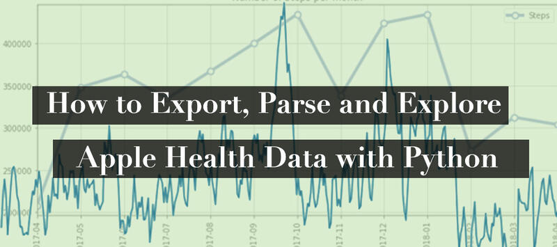
I recently created an open source project called Quantified Self Ledger. These are a collection of Python scripts that help to collect, process and aggregate data from various services like Fitbit, Apple Health, RescueTime and more. The initial goal is to collect and aggregate various self-tracking data. The end goal is to build a personal data dashboard and hopefully one day leverage it for more sophisticated data science and machine learning. In this post, I want to look at Apple Health. For example, how to export, parse and do some data analysis on your Apple Health data using Python. In later posts, we will look at a few other data points and tracking services.
If you are an Apple user, then your iPhone has been tracking your steps and a host of other health metrics. Some are directly recorded by the phone. Others are logged via other health apps that store their data into the Apple Health repository. If you also regularly wear an Apple Watch during the day, during workouts and at night, then you have even more data, like Heart Rate, VO2 Max, and possibility even Sleep.
In this post, we will be exploring Apple Health Data. First, we will look at some methods for exporting your Apple Health data, either using Apple’s raw export or an aggregated version using QS Access app. Second, we will then use some code to parse and process our raw Apple Health logs into more usable formats. Third, we will do some data exploration and data processing, so we can understand patterns and trends. Finally, we use this data to create some data visualizations in Python.
Whether you are merely curious or are trying to use tracking to support lifestyle changes and better habits, hopefully by the end of this post, you’ll understand what data you are collect and hope to start engaging with that data.
Exporing and Preparing Your Apple Health Data
As an Apple user all of your health data gets logged into a locally stored system called Apple Health. Originally setup as a local data storage of health data, Apple Health app has evolved to provide some decent visualizations of your recent activities and appears to be positioned to become a key part of storing and managing your electronic medical record (EMR) too.
While the Apple Health app provides a decent look into your health and movements, you aren’t really going to be able to do any data analysis there. Instead, you’ll either need to use a third party app or external program to explore your data. Fortunately, it’s pretty easy to export your data in its raw state via your iPhone or in a more aggregate form using a third-party app like QS Access.
Data analysis and data visualization can take on a lot of forms. I’m a big fan of data exploration and data visualization with a spreadsheet application like Excel or Google Sheets. To go deeper, Tableau also offers a good way to visualization your data. Ultimately though if you want to do a complete data analysis, data visualization and potentially data modeling, you’ll need to use either R or Python.
Let’s get started by getting some of our Apple Health Data.
QS App: Simplest Way to Export Apple Health Data
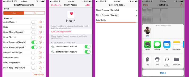
The first and easiest option for exporting your Apple Health data is to use the QS Access App, a free iOS app developed by Gary Wolf, Kevin Kelly, and the team at Quantified Self. It’s purpose is simple: export your data from Apple Health into a useable format, like CSV, so you can explore it.
After installing the app, select the specific data points you want to export. (NOTE: You may receive a popup about access permissions. Accept these and allow access.) Once you’ve selected the data points you want, hit “Create Table.” the process may take a several minutes, depending on the amount of data you have in Apple Health. This delay might be longer if you have a lot of data from several years and are exporting your steps and heart rate.
The end result of QS Access export is a well-structured CSV file, which you can open and explore in any spreadsheet application. This is also also good format to use in Tableau, R, Python, and even just a spreadsheet application like Excel or Google Sheets.
The one thing to notice about this export format is that it will add blank records for non-data. This means if you export your Blood Pressure data, you’ll end up with potentially thousands of extra and blank rows. In the case of steps, this is a good thing, since you’ll then have noted hours where you did zero walking. In other data points, this export format makes less sense and results in a lot of unnecessary and confusing data.
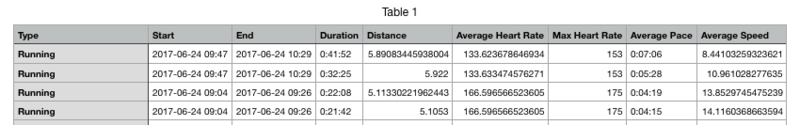
The only thing missing from the QS Access export is your workout data. Fortunately, as I explained in detail in How to Track Your Workouts, you can use Workout Export app to get your workout data into a CSV too.
The end result is a row for each workout with key workout metrics:
You can even Export Your Apple Health Workouts to Your Calendar!
If you are not particularly technical and are just looking to get a clean and simple export of your Apple Health data, QS Access and Workout Export apps are your best bet.
How to Get the Raw Export of Your Apple Health Data
Privacy appears to be more important with Apple devices. For example, one of the interesting design choices for Apple Health is that your data is all stored locally on device. Unlike Google Fit, your data is not automatically synced to the cloud or available on an Apple website. Unlike Google Fit or Fitbit, you cannot view your Apple health data on a website or pull the data from an API.
In fact, Apple doesn’t have access to this data unless you provide it directly to them in an export. This means that if you lose or break your phone, then you’ll also lose your health data. So, if your data is important, then you should invest in regular backup of your full data to iCloud or at least regularly export your health data export.
Admittedly having your health data in the cloud would make integration and access much, much easier. For example, Google and Fitbit, sync your steps and other data point to the cloud. This makes it possible to access your data via their API, as I’ve shown in my Fitbit integration in QS Ledger.
Now that we have looked at a few third-party options like QS Access to export a processed version of your Apple Health data, let’s look at the raw export you can get directly from Apple.
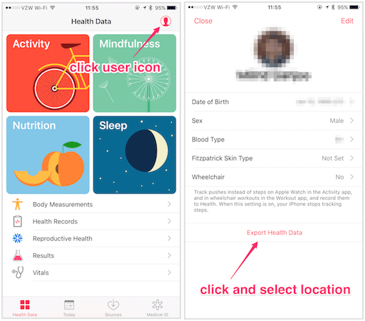
In order to get the raw export, go into the “Apple Health” app, tap on your user icon and then select “Export Health Data.”
This export process may take a few minutes, and, once completed, you should then have a filed called “export.zip”. You can share the file with yourself via AirDrop, Email or any other method.
Let’s look at the raw data provided by Apple.
XML Format of Your Apple Health Data
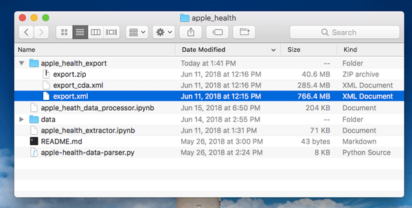
Once you unzip the raw export from Apple Health, you’ll notice a few things.
First, you’ll discover two files: export.xml and export_cda.xml. Unless you are a programmer or technical person, it’s likely you may not be familiar with XML. Extensible Markup Language (XML) is a special markup language that allows you to create well-formatted documents for storing different kinds of information. This structuring and format makes it both human-readable and machine-readable. XML is the format used on most RSS and Podcast Feeds too.
While you can find a number of posts complaining about how unusable or how unfriendly this file format is, the reality is that XML is an extremely robust choice, and, as we will show shortly, this format is relatively easy to be read by computers, and it can be converted into other formats (like CSV) or imported into a data frame, which is a structured data format used in most data science work.
Second, in looking at these files, you might be surprised how big they are. Your iPhone is collecting and tracking a lot of information. For example, in my case, the zipped export was 37 megabytes, and unzipped the files were well over 900 megabyes. The amount of data here creates some challenges in processing and using it, but it also means there is a lot of data to be used too.
As a side note, this Apple Health data is actually not the raw sensor data. Your watch or phone is interpreting sensor data and then aggregating it into the stored results. So, if you want to go one step further into the raw data that your device’s sensors are recording, checkout apps like SensorLog. SensorLog will record the actual numbers from the various sensors, like accelerometer, gps, pedometer, altitude, gyroscope, motion, audio and more. After only a few minutes of recording, you’ll end up with thousands of results and a log file over several megabytes.
Technical Note
Online you’ll find a number of code samples and methods for converting your raw Apple Health XML data to a more usable format.
For our purposes, I’ll be using Python 3 Code, which you can find here: https://github.com/markwk/qs_ledger/tree/master/apple_health. This code is based on In Defence of XML: Exporting and Analysing Apple Health Data and the Python 2 code found at: https://github.com/tdda/applehealthdata.
If you are new to Python and not sure how to get started, I suggest downloading and installed the Anaconda distribution. This is the most friendly setup for getting started with using Python for data science, and it comes prepackaged with the most useful extensions.
If you are a programmer in another language, then you should be able to find some open source code to get started in that language on Github.com.
Converting Apple Health XML to CSV with Python
As I noted in a previous section, the raw Apple Health export is in XML format. So, our first task is to convert it into something more useable, like CSV. Alternatively we could process it directly into a data frame or alternative storage model, which we will look at in a later section.
First, download or clone the code from github.com/markwk/qs_ledger.
Second, locate your apple health export and place it inside of qs_ledger’s sub-directory, “apple_health.” The end result should look something like this:
Third, start Anaconda and launch Jupyter Notebooks with Python 3. Alternatively, from the command line, you can launch it with the following command:
$ jupyter notebook
This will trigger a running process for Jupyter and open Jupyter notebook in a browser.
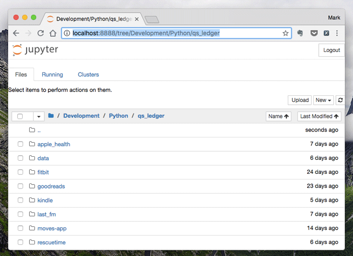
Fourth, in the browser, navigate to the local directory for qs_ledger. In my case, the address is: http://localhost:8888/tree/Development/Python/qs_ledger
It should look something like this:
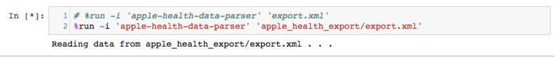
Fourth, then go into the apple_health directory and open apple_health_extractor.ipynb:

Fifth, check that the top lines to confirm the location of the apple export:
# %run -i 'apple-health-data-parser' 'export.xml'
%run -i 'apple-health-data-parser' 'apple_health_export/export.xml'
Sixth, select the cell and run SHIFT + ENTER:
This process may take several minutes to run depending on the size of your Apple Health directory.
After the completing the process, you should have several new files. Each file should include a CSV export of that health metric. This data should be both well-structured and quite verbose, meaning it contains everything originally stored in Apple. You can easily use any of these files to start your data analysis in your favorite data analysis tool like Tableau or even explore it in a Spreadsheet application.
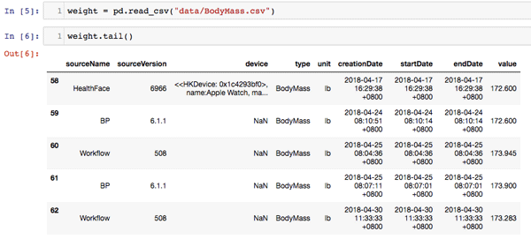
If you want to run some additional checks, run the remaining cells in apple_health_extractor.ipynb to check and count the data. Here is a sample of my weight data:
Two important things to note about this data. First, the timestamps are in UTC time and haven’t been adjusted to a local timezone. Second, if you both wear an apple watch and carry your phone, then you’ll have some overlapping or duplicate data. We will correct these issues and a few other aspects in the next sections.
ALTERNATIVE: Converting Apple Health XML to Feather Data Model with Python
Another method for extracting and parsing your Apple Health data is to convert it to Feather. Feather is a relatively recent data storage method, and it is method I recommend if you are a more serious data scientist. Feather allows data portability with both R and Python and it has some performance optimizations too. You can find good starter code here: github.com/mganjoo/apple-health-exporter
Processing and Exploring Apple Health Data with Python
Now that we’ve extracted our Apple Health data into a more usable format, it’s time to explore and process the data. As noted previously there are a couple issues with the data, namely the timestamps haven’t been localized and we have duplicate data from both the watch and phone. Additionally none of the data has been aggregated into anything useful like hourly or daily stats. Let’s correct these issues one by one.
Adjusting to Local Timezone
In qs_ledger/apple_health, open up the file, apple_heath_data_processor.ipynb. This file will walk us through a step by step method of fixing the timezones, assigning more time-based references, and enable us to aggregate it into more useful stats.
In order to fix these timezone errors, we will use the python timezone package and leverage a couple of simple functions to convert from UTC to our own timezone. We then set a few relevant date references:
convert_tz = lambda x: x.to_pydatetime().replace(tzinfo=pytz.utc).astimezone(pytz.timezone('Asia/Shanghai'))
get_year = lambda x: convert_tz(x).year
get_month = lambda x: '{}-{:02}'.format(convert_tz(x).year, convert_tz(x).month) #inefficient
get_date = lambda x: '{}-{:02}-{:02}'.format(convert_tz(x).year, convert_tz(x).month, convert_tz(x).day) #inefficient
get_day = lambda x: convert_tz(x).day
get_hour = lambda x: convert_tz(x).hour
get_day_of_week = lambda x: convert_tz(x).weekday()
NOTE: To adjust to your timezone, replace “Asia/Shanghai” with your timezone selection.
Let’s start by walking through the steps data. Here is what the raw data looks like:
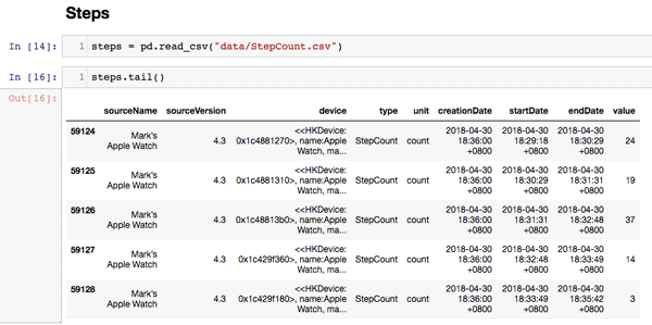
We can then parse out the date and time elements as Shanghai time.
steps['startDate'] = pd.to_datetime(steps['startDate'])
steps['year'] = steps['startDate'].map(get_year)
steps['month'] = steps['startDate'].map(get_month)
steps['date'] = steps['startDate'].map(get_date)
steps['day'] = steps['startDate'].map(get_day)
steps['hour'] = steps['startDate'].map(get_hour)
steps['dow'] = steps['startDate'].map(get_day_of_week)
Here is the result:

As you can see, we’ve adjusted and assigned various time references like year, month, date, hour, and day of the week. These will allow us to aggregate and calculate key statistics about steps.
Let’s start with a simple example using steps:
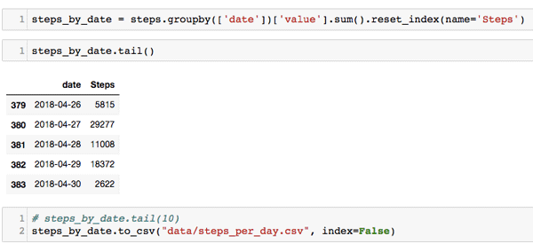
First, we group steps by the date and sum their value. We then create a new data frame called “steps_by_date.” We can then see each date has a steps total and export it to CSV.
There is one problem though. This includes both step data from both the watch and phone. While other data points are unique, steps is a special example since it is collected on both the phone and watch. Let’s clean this up in the next section.
Adjusting for Overlapping Data from Apple Watch and iPhone
Before getting too excited about how many steps you are doing, it’s important to adjust this for duplicate steps we are collecting on both the phone and watch.
Run the following commands, which will separate step counts by device and year:
steps_device_by_year = steps.groupby(['year', 'sourceName'])['value'].sum().reset_index(name='Steps’)
steps_device_by_year
Here are my results:
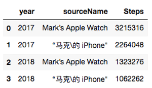
As you can see, I have markedly different results on the phone and watch, and the combined results increases my step count by nearly 70%!
In order to get more accurate results, we need to make some adjustments. The simplest and easiest option is to simply use your watch steps. In my case, since for nearly all of my walking I am wearing my smart watch, this is the best option too.
First, get the device names:
steps.sourceName.unique()
Second, configure the following command with your watch name and run:
steps = steps[steps.sourceName == MyAppleWatch]
This change filters by only the watch data and now gives us a more accurate total step count.
There is probably a more sophisticated way to get these numbers without completely dropping the phone data. But as a starting point this is a good solution.
Simple Data Explorations and Visualizations with Python
Using our processed data, we can create various visualizations.
Rolling Mean Step Count
Let’s start by looking at the rolling mean of our step count. While the daily step count shows considerable variance on high and low days, a better approach is looking at the 10-day average or rolling mean. Here is the code we can use to calculate this:
steps_by_date['RollingMeanSteps'] = steps_by_date.Steps.rolling(window=10, center=True).mean()
It’s then simple to visualize this with Matplot:
steps_by_date.plot(x='date', y='RollingMeanSteps', title= 'Daily step counts rolling mean over 10 days', figsize=[10, 6])
Here is the result:
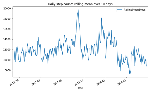
Why is there a spike in step count in the last few months of 2017? I was training for a marathon, which included two half marathons.
Step Counts by Days of the Week
First, let’s create a day of the week column:
steps_by_date['date'] = pd.to_datetime(steps_by_date['date'])
steps_by_date['dow'] = steps_by_date['date'].dt.weekday
We can then use some simple code to group the data by day of the week, get the day of the week mean:
data = steps_by_date.groupby(['dow'])['Steps'].mean()
And then chart it:
fig, ax = plt.subplots(figsize=[10, 6])
ax = data.plot(kind='bar', x='day_of_week')

n_groups = len(data)
index = np.arange(n_groups)
opacity = 0.75

ax.yaxis.grid(True)

plt.suptitle('Average Steps by Day of the Week', fontsize=16)
dow_labels = ['Monday', 'Tuesday', 'Wednesday', 'Thursday', 'Friday', 'Saturday', 'Sunday']
plt.xticks(index, dow_labels, rotation=45)
plt.xlabel('Day of Week', fontsize=12, color='red')
Here’s the visualization:
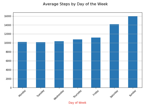
Not surprisingly, I get more exercise and running on the weekend. Thus, I see a higher daily average on Saturday and Sunday. While 10k steps is a pseudo-science number, I’m still happy to see my weekday step count is above 10,000 steps.
Additional Step Visualizations
Here are two other visualizations that attempt to show some of my walking trends: Number of Steps Per Month and Steps by Hour of the Day.
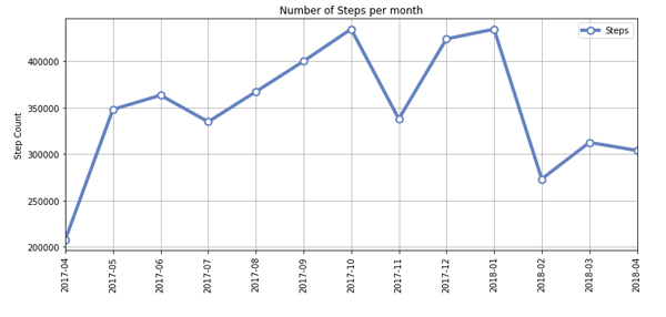
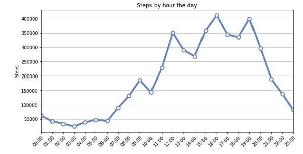
These are just a few examples using steps data from Apple Health. Additionally, it is quite simple to adopt this code for other data points like Sleep, HRV, weight, and others.
Conclusion:
In this post, we looked at how to export, parse and extract health data from your Apple Health device. The easiest starting point are apps like QS Access and Apple Health Workout Exporter, which allow you to access your data in a spreadsheet data. We specifically looked at the raw XML export from Apple Health and how to parse it first into a CSV and, in turn, into timezone-adjusted and aggregated stats. This then allowed us to see various patterns like my rolling average of steps per day, days of the week with the most steps and even which hours of the day I’m typically walking. This code and the approaches can provide a great starting point for exploring any of the other health data points collected by your Apple iPhone or Watch.
While much of the discourse recently has focused on data leaks and data privacy, I find this misses the incredible opportunity for self-understanding and self-improvement we can gain from personal data and self-tracking. It’s somewhat ironic that so many people clamor for data privacy when most don’t even know what data they have. I don’t disagree that data privacy is a critical topic both today and in the year to come, but I encourage a healthy engagement with your data too.
For past few years, I’ve been writing and building data tools for both tracking and exploring personal data. One dimension of my work aims at tracking new data points. I’ve built a web app to log your podcast listening called www.PodcastTracker.com, and I’ve created a photo analytics and auto-tagger app for iOS and Android called PhotoStats. PhotoStats lets you view your photo taking life and auto-tag photos so you know what you take pictures of.
Another dimension in my data work is aggregating, combining and understanding our personal data. We can now collect data on our time, our habits, media watching and many others. This results in more data but often it is silo-ed in that service, leading to personal data fragmentation. If you want to understand and leverage your data, you need to get some kind of data convergence. This is why I’ve created an open source project called Quantified Self Ledger. The primary goals are to help aggregate your data, to build a personal data dashboard, and hopefully one day to build some more advance data analytics with machine learning and artificial intelligence. The project already includes integrations for Fitbit, RescueTime, Kindle Highlights, Last.fm, Todoist and Toggl, and, as we’ve looked at in detail in this post, Apple Health Data.
People track their lives for various motivations and reasons, but the two most significant in the research are “self-healing” and “self-design.” Specifically, for self-healing, people track their fitness and health in order to better deal with a disease or injury and navigate concerns with their existing medical care and doctors. Self-design refers to the idea that people use data and self-tracking as a way to support and create their kind of life.
Whatever your reasons for tracking, I believe it’s important to more than just track; the key is engage with your data. Tracking and online tools should and often do provide data accessibility and exports. This data, like Apple Health data, can be used with spreadsheet or more complicated data science tools, to help you understand your current health status and even better support a new and improved “data-driven you.”
Best of luck and happy tracking!
APPENDX:
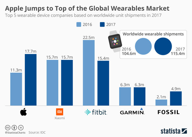
SOURCE: https://www.statista.com/chart/13115/worldwide-wearable-device-shipments/